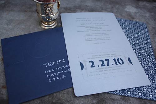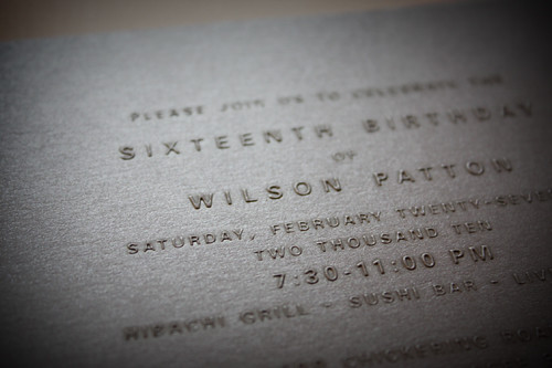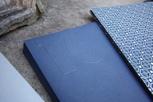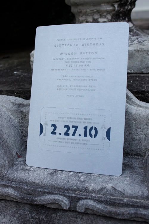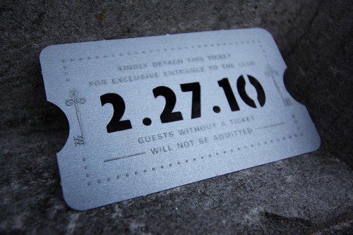
Our assignment was to design an invitation that you'd receive from the most exclusive new club in town. It was for a sweet 16 party and needed to be incredibly cool to grab all the teenagers attention. After all… they've seen everything. Our concept started with a masculine color palette and two beautiful paper stocks in silver and deep blue. The paper did all the work. In fact, we never even used any ink. The front had the type raised with no color on top, the back was a silver foil pattern, and the numbers were die cut to reveal the blue. The best part, in our mind anyway, was the ticket at the bottom. It was something every guest was "required" to bring for admission into the party. Hopefully all the kids felt very special receiving this in the mail!